This project came from one of my favorite statistics class; statistical graphics and visualization. For this class, we went through a curriculum that gave a great foundation on how to represent data that is given. This varied from simple barplots, to more uncommon methods such as heat maps or wvioplots.
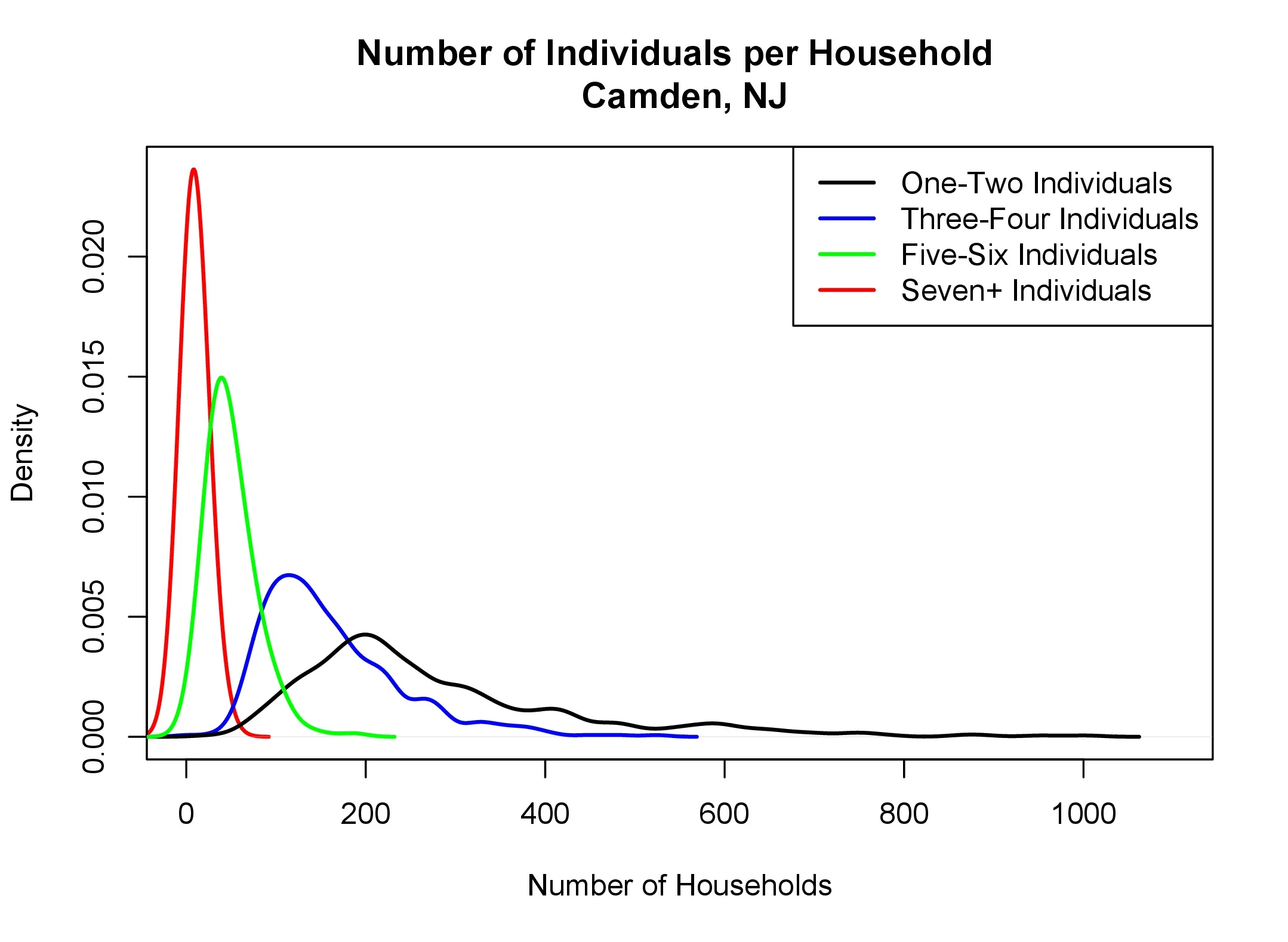
In this project, we were given a US census data set. From here, our professor informed us that the goal is to present anything meaningful. It was great because it really allowed our group to start exploring real data sets and test our knowledge in a real life setting. Each of these graphs display the unique aspects we learned regarding the Philadelphia Camden population.
Most unique about this data set was like every other data set; the cleaning. Census data is projected either by metro zips or by state. Because of this, our team tackled the difficult task of joining two data sets together.